
Color psychology mainly means the use of colors to influence how people feel and behave in a space. Different colors can clearly evoke different emotions and moods, and understanding the meaning of each color before it affects our inner being is a priority. And this blog is a try to uncover that for you, enjoy!
Let’s start with
1. Warm Colors
These colors are usually shades of red, orange, and yellow and are often associated with feelings of energy, warmth and excitement. Examples of warm colors are, scarlet, peach, amber, sienna, gold, camel, deep grays, and Taupes.
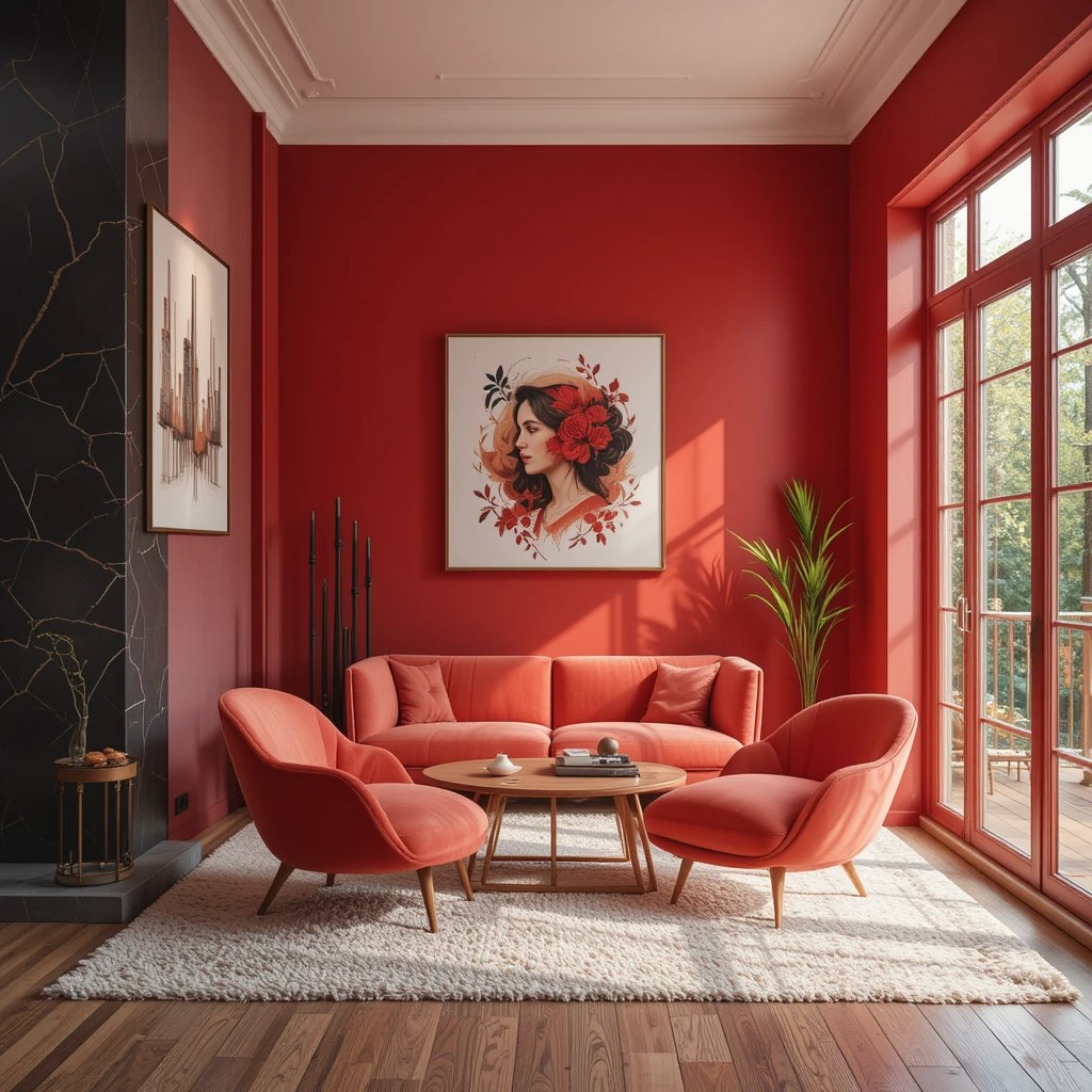
a. Red: This color can stimulate energy, passion, excitement and boost confidence, but can also trigger anger, danger and violence. Always look for the brighter side, but it’s up to you.
- Apply red as an accent wall in kitchens, dining areas, or home offices.
- Use red décor items, like furnishing or rugs, to add a touch of dynamism.
- Balance red with calming tones like white or beige to maintain emotional equilibrium.
- In kitchen and dining areas, red can increase appetite, making it a good choice for these spaces.
- Red can trigger energy, making it a good choice for creative spaces.
- For bedrooms, bathrooms, and living areas, red is associated with high energy, so it is best to avoid using it in these spaces where you would like to relax.
- Red is also associated with love, desire, and seduction.
- It is great accent color, especially in kitchens.
- One of the most used and adaptable hues in art and design is red.
b. Orange: It is associated with feelings of enthusiasm, excitement, and creativity. This color can also evoke feelings of warmth, happiness and cheerfulness.
- Orange colors can increase energy levels and boost creativity.
- It can promote a sense of cheerfulness and can be welcoming to visitors.
- Orange can radiate warmth and happiness.
- It can symbolize optimism, happiness, enthusiasm, and youthful connections.
- Use orange accessories, such as cushions, rugs, and curtains, to add warmth and texture to a space.
- Try orange in bathrooms and kitchens, where the yellow would also be suitable.
- Use orange in spaces where you want to stimulate and excite, such as in living rooms.
- Apply different shades of orange to create different feelings. For example, bright orange is attention grabbing, while peach is soothing.
- Orange is also considered a spiritual color and an autumnal season color.
- And keep in mind that the color orange can elicit feelings of arrogance, pride and impatience.
c. Yellow: Yellow is associated with happiness, optimism, and joy. It can also evoke the feelings of warmth, creativity and enthusiasm.
- Yellow can make a room feel more open and cheerful. It can also help brighten dark or small spaces.
- Pale or pastel shades of yellow can create a calming ambience.
- Yellow can add vibrancy to a space. You can use yellow sofas, headboards or cushions.
- Pair yellow with white or gray or combine yellow with blue or green, for optimal experience.
- In large amounts, yellow can be overwhelming or anxiety inducing, especially if you are already stressed.
- Too bright yellow can spark feelings of agitation; too dull yellow may make you feel jealous or ill.
- Yellow generally used to make someone pause and take note of their surroundings, such as in traffic lights, stop signs, or hazardous warnings.
2. Cool Colors
Cool colors include blue, green, and purple and their shades and combinations. They are often associated with calm, serenity, and relaxation.
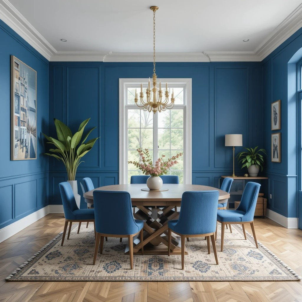
a. Blue: It is associated with feelings of calmness, serenity, and peace and it is one of the most studied colors in color psychology because its impact on mental wellbeing.
- Lighter shades of blue create an airy feel in bedrooms, bathrooms, and living spaces.
- While deeper shades make a sense of sophistication in living rooms.
- In therapeutic contexts, primary blue is utilized to promote calm and meditation.
- Blue can help you unwind, find peace, and become more comfortable expressing your inner feelings.
- Can help with insomnia.
- Blue can promote intelligence, serenity, and loyalty.
- It can make you feel calm and soothed.
- Blue can evoke feelings of community and connectedness.
- Bear in mind that too much exposure to dark shades can trigger feelings of sadness, loneliness, or lethargy.
- Lighter colors like sky or turquoise suggest softness, while deeper colors like navy or royal blue provide a manlier vibe.
b. Green: Green color is associated with balance, serenity, and joy and it can improve your mood and help you feel more connected to nature.
- Green is considered the most balanced color.
- It can help alleviate anxiety and depression.
- Green can elicit a sense of hope.
- This color can enhance feelings of love, joy, and inner peace.
- Recent studies have shown that exposure to greenery can reduce stress.
- Green walls can create a refreshing atmosphere.
- Green furniture, upholstery and accessories can help create calming and relaxing atmosphere.
- Incorporating plants or vertical moss frames can enhance the green color scheme and make you feel closer to nature.
- Adding nature-inspired artwork to your house might help you reap the advantages of green therapy.
c. Purple: This color can evoke feelings of relaxation, creativity and luxury and it can also create a sense of drama and opulence.
- Lighter shades of purple can make you feel more hopeful or optimistic.
- Darker shades can inspire feelings of power or strength.
- Subtle uses of purple can bring out a sense of belonging.
- A rich, dark purple can add a sense of luxury and cosiness to a house.
- In bedrooms lighter shades can create a soft romantic look.
- Purple in dressing rooms can create a special getting ready destination.
- Purple colored entrance hallways can impress guests.
- Darker purple on statement walls or focal points can create a sense of drama and opulence.
- Purple paired with gold or silver accessories can create a glamorous look.
- Purple is also the official color of the addiction recovery movement.
3. Other Colors
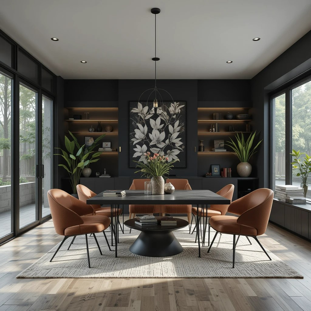
a. Black: Black can evoke a range of emotions, from mystery and drama to elegance and power, it can also be used to create a striking visual contrast or to add a touch of drama and intrigue. However too much black can be dark and depressing.
- Use black as an accent color to add drama to any room.
- Pair black with lighter hues to create a dynamic atmosphere.
- Use black to create a sense of intimacy and coziness in smaller spaces.
- Use black as a sleek and modern backdrop for larger areas.
b. Brown: Brown is a warm, grounding color that can evoke feelings of comfort, safety, and stability and it can also symbolize resilience, dependability and authenticity.
- Use brown in reading nooks, home offices, or living rooms to create a warm and inviting space.
- Use brown furniture, accent walls or cabinets to add a touch of nature to your home.
- Brown blends well with most other colors, and can add stability to bright colors like orange or yellow.
- Lighter shades of brown can work well for beach inspired, Scandinavian, traditional, or rustic interiors.
- Darker shades of brown can create a rich, more sheltered atmosphere.
c. Pink: Pink is generally associated with feelings of calmness, love, tenderness, and nurturing, making it a popular choice for bedrooms and spaces where relaxation is desired.
- Pink is widely recognized for its ability to reduce feelings of anger and anxiety, creating a tranquil environment.
- Due to cultural associations, pink is often linked to femininity, romance and affection.
- Lighter shades of pink can feel more delicate and nurturing, while brighter pinks like fuchsia can convey energy and confidence.
- Pink is particularly well suited for bedrooms, nurseries, and relaxation areas.
d. Gray: Gray is a neutral color that can evoke feelings of balance, serenity, and sophistication, and it can also create a sense of security and intelligence.
- Gray can complement and enhance a wide range of hues.
- It can be used in both modern and timeless design schemes.
- This color can create a cool, serene atmosphere when combined with blue.
- Gray can create a cozy, inviting feel when pair with warm tones likes beige.
- It can add a pop of contrast and visual interest when combined with bold colors like red or yellow.